


Table of contents
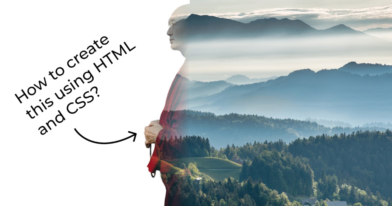
Today we are going to learn in 2 minutes how we can create this double exposure effect using just HTML and CSS so let's start!
Setup
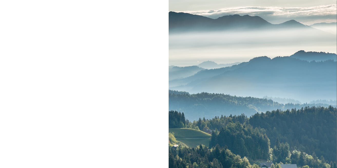
To create this type of effect you need an image of a person with the removed background and a background image, in my case, it is a Buddhist monk and a forest valley respectively.
Skeleton
First of all, create a simple html page with the following code
<body>
    <div class="img_container">
        <img src="portrait.png">
    </div>
</body>
this contains a body with an image container which has an image with the source removed background image of a monk.
Styling
Now main part
style the body tag to have a background image but only in the right half of the screen you can achieve this by the following code:
 body {
   height: 100vh;
   width: 100vw;
   display: flex;
   align-items: center;
   justify-content: center;
   background-image: linear-gradient(to right, white 50%, transparent 50%),
     url(./bg.jpg);
   background-size: 100vw auto;
   background-position: center;
 }
here I am making the body a flexbox with children at the center then setting the background image to a linear gradient with defined percentages which removes the gradient effect and gives two side-by-side blocks of colors and then setting the background image URL.
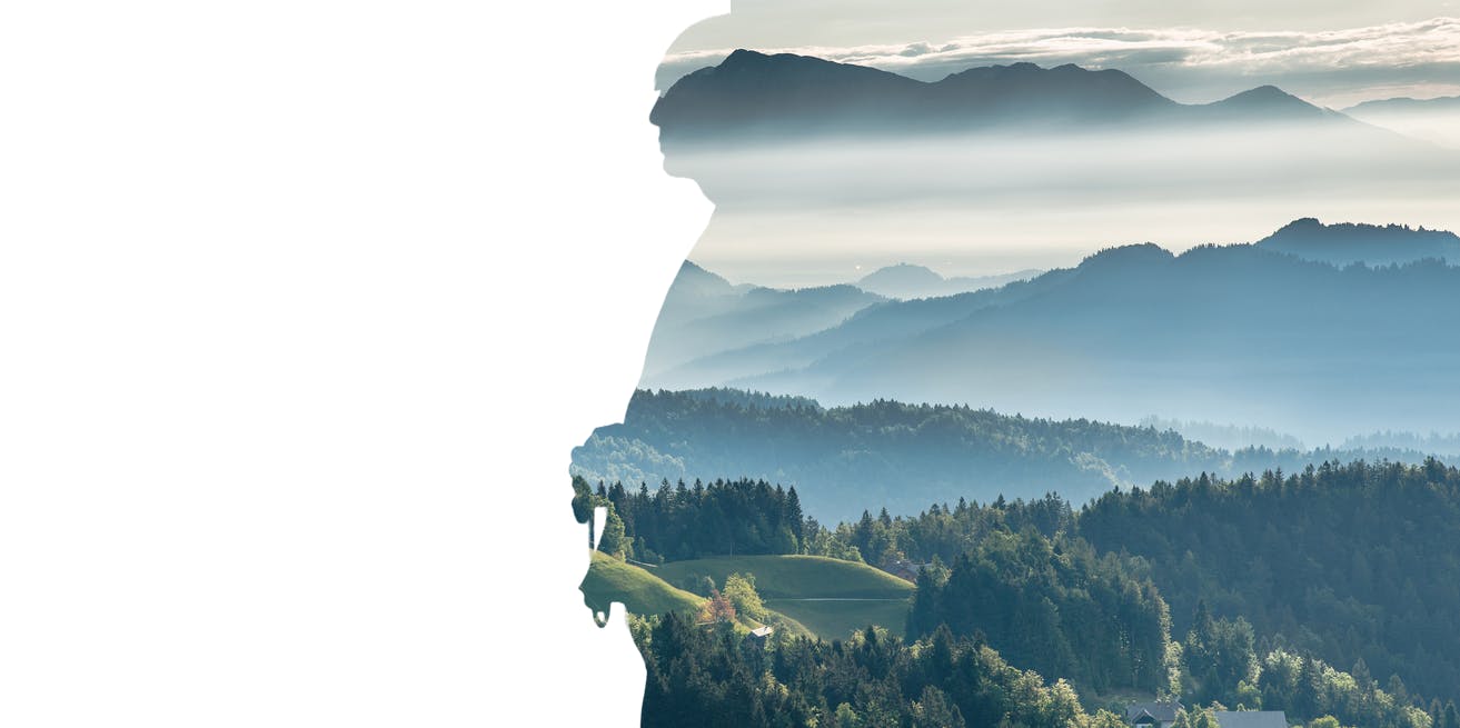
Now let's style the image container with the following style
 .img_container {
   height: 100vh;
   width: fit-content;
   background-image: url(bg.jpg);
   background-size: 100vw auto;
   background-position: center;
   -webkit-mask-image: url(./portrait.png);
   mask-image: url(./portrait.png);
   -webkit-mask-position: center;
   mask-position: center;
   -webkit-mask-size: cover;
   mask-size: cover;
 }
here I am setting the height of the container equal to the body with the background-size and image equal to the body and masking the container with the monk's image which gives us the following result.
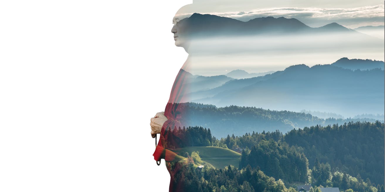
Now the final part styling the monk's image with the following code
 height: 100%;
   width: auto;
   -webkit-mask-image: linear-gradient(to left, transparent, transparent, white);
   mask-image: linear-gradient(to left, transparent, transparent, white);
here we are making the height of the image equal to the container and `width:auto` to maintain the aspect ratio and then setting the masking image equal to a linear gradient to give that fading effect from left to right.
Conclusion
This is the 3 step process to create a double exposure effect in HTML & CSS. If you liked this post then like and comment as I am planning to post a blog each day with tips and tricks related to web development.