

Give your animations a direction using ray() function in CSS
ray() function is one of the many Motion Path function in CSS which let us animate an element along a ray with definite length


With the introduction of the Motion Path function in CSS from Chrome 116 we now have various functions that can be used to create very catchy and interesting animations with just a few lines of code. Today we will talk about ray() function
ray()
ray() function in CSS lets us animate an element along a ray. it takes the following parameters
angle - starting at
0degat the y-axis and going forward in a clockwise direction with an increase in it.size - used to specify the size of the ray
closest-side - distance between the starting point of the ray and the closest side from that point of the containing block
closest-corner - distance between the starting point of the ray and the closest corner of the containing block
farthest-side - distance between the starting point of the ray and the farthest side from that point of the containing block
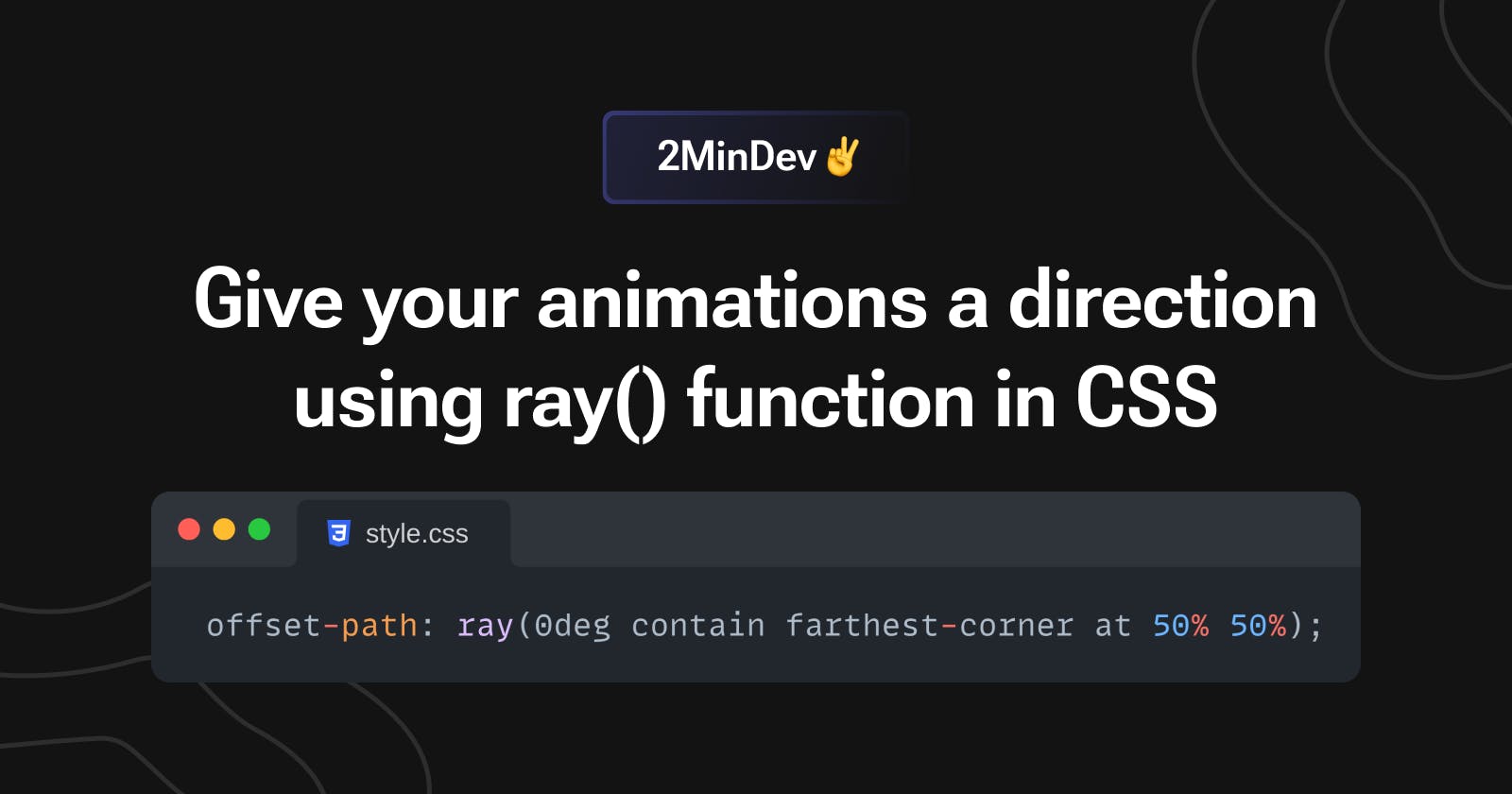
farthest-corner - distance between the starting point of the ray and the farthest corner of the containing block
sides - distance between the starting point of the ray and the point on which it intersects the containing block.
at <position> - to specify the starting position of the ray
contain - keyword to reduce the length of the ray so that the animated element stays within the boundary of the containing element
Example
Let us see an example which will help us better understand how this function works
suppose we want to animate an element from the center of the containing block towards the edges but in a spiral path then our animation will look like this
@keyframes spiral {
  0% {
    offset-path: ray(0deg closest-side at 50% 50%);
    offset-distance: 0%;
  }

  100% {
    offset-path: ray(1800deg closest-side at 50% 50%);
    offset-distance: 100%;
  }
}
here as you can we are animating our element from the starting point (at 50% 50% containing block) to the end of the ray whose length is equal to the distance between the center point and closest-side also we are changing the rotation of the element(0deg to 1800deg) which causes the spiral path of the element.
As you can see our element is overflowing the containing block at the end of the animation if we do not want this behavior then we can add contain keyword to the function and then it will make sure that it does not overflow the container during the animation.
Pitfall
It currently works on Chromium-based browsers only.
Thanks for reading.